DigiPak: First Stages
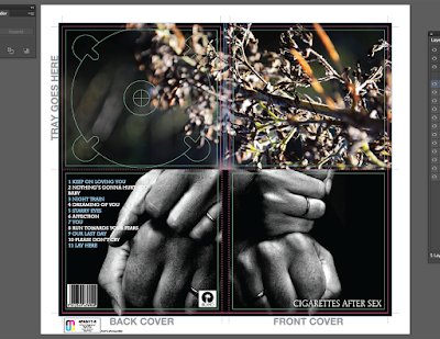
The first ancillary product that I have begun to create is the DigiPak for my chosen artist. To start, I downloaded a DigiPak template from the Internet using the site "discmakers.com". This template has the dimensions of a 4 panelled and 1 tray (4PAN1T) DigiPak and was a great starting point when it came to laying out my final design. I went into the creative process with the intention of bringing colour through the inside covers and using a monochromatic design on the outside so that it adhered to the aesthetic of my chosen artist - Cigarettes After Sex.
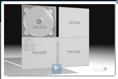
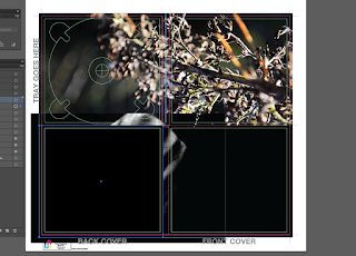
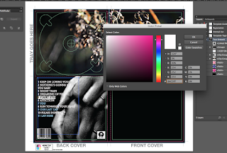
Once I had imported the template file into Illustrator (format AI), I went through the process of unlocking the text layers that came with the template. I then proceeded to delete these layers of text as I no longer needed them (Note the coloured text on the far left of the back cover). Once I had removed these extra layers of text, I had a clean template so I could start importing my images to use for my DigiPak design. Starting off, I drew a blacked out rectangle that would then act as a clean background that I could upload my images onto. The reason why the background was black is because the majority, if not all, of my images are darker toned and having a lighter backing image poses the risk of segments showing from behind the images if the images aren't adjusted and placed properly.
 |
| First Look |
The image that I decided to use on the inside cover of my DigiPak design was taken from a still of my music video. Aesthetically, the image is one that exhibits my flair with depth of field photography with macro focusing - thus, when I opened it in Illustrator, the quality and resolution of the image didn't falter or decrease. The image shown stretches over the right and left inside cover areas because I wanted to create continuity within the design - instead of having two images that were broken up. Before importing the image into Illustrator, I opened the image in Photoshop (see previous post) and edited it according to the colours and hues that I wanted. I increased the shadows and saturation in the image and used a selective colour tool to pin-point certain areas of the branch that I could enhance without affecting the whole image.
 |
| Adding Barcode Vector and Record Label |
After I had placed the image for the inside covers into the document, I then proceeded to go onto the Internet to search for vectors of barcodes and record labels. The reason why you want vectors instead of standard PNG files is because vector files have higher resolutions, and the overall quality won't change once you resize the image. To resize the images, I held 'Shift' whilst I dragged the image to conform to the dimensions that I wanted. Holding down 'Shift' allowed for a more controlled resize of the images and would keep the contents of the file (for example, the numbers in the barcode) the exact size that I needed.
 |
| Barcode Vector Placed |
Once I had finished resizing both the barcode and the record label vectors, I toyed around with the placement and tried to figure out which looked better. Originally, I had the two images on top of each other on the bottom right-hand side of the back cover. After gathering personal opinions from my peers, we all agreed that it looked a little cramped and didn't add an element of professionalism to the DigiPak that I want in my final design. So, with this in mind, I reworked the placement and decided that I would have the barcode on the bottom left-hand corner and the record label on the bottom right-hand corner. I believe that this placement looks great and as I move further into my development of the DigiPak, I will integrate the publishing information in between the two images - this is because I have seen this been done from my external research of other DigiPaks of major artists.
 |
| Playing around with placement |
The placement of these two separate features are important as even though they are seemingly minute details to a DigiPak, they can help create an overall clean and professional aesthetic of the product. Every CD DigiPak has a barcode as this makes it accessible for purchase by mass audiences, however, based on the design, it can be altered and edited so that it conforms to the general aesthetic of a product. For example, a grunge/rock band may choose to have a gritty, broken or distorted barcode - but one that is obviously still legible and legitimate. I weighed the pros and the cons of having an edited barcode, but decided that keeping it simple would be the better option - as this generally conforms to the genre of my band and I didn't want to have a "warped" looking barcode and take the "Dream-Pop" genre too literally.
 |
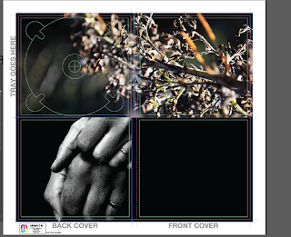
| Back image imported into the DigiPak Design - clipping mask |
Moving on, I then imported the image of my parents' hands into the document to use as the back cover for my DigiPak. Because I already had a rectangular black background, when I inserted the image into the document, it was lost behind the rectangular shape. I also lost the text, barcode and record label that I had already applied to the back cover. To combat this, I right clicked on the image and pressed "Transform" and "Bring to Front" - this then brought the image in front of the black background, but I was still left with one problem - the text, barcode and record label was now under the image that I had imported. Before I made any changes, I had to resize the image by holding down shift (as to not lose the resolution or quality of the image) and applied a clipping mask using the rectangular drawing tool and the "Make Clipping Mask" option. The clipping mask essentially cropped the image but didn't distort the resolution of the image and once I had completed this action, I then repositioned the image so that it fitted perfectly with the dimensions of the back cover. After I had finished this task, I then realised that the barcode, text and record label was still missing, so I repositioned the image temporarily and right-clicked on each of the three features and clicked "Transform" and then again, "Bring to Front" - this action meant that these features would be on top of the back image.
 |
| Clipping mask applied - lost text and barcode |
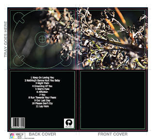
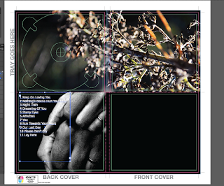
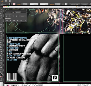
Once I had sorted this minor problem, I then started to tweak the positioning of the text; I centred it, sent it to the left and to the right. As evidenced, having the text centred over the image didn't look good and because the text was white and the image behind it is monochromatic, you lost some of the track list and it was unreadable. Having the text off-set to the left was better because there was a black area where the image had no object in it and the white text was easily readable. Despite the new placement working, there were some elements of the text that were slightly lost within the white areas of the back image of the hands. So, taking inspiration from the original tour posters of Cigarettes After Sex and the alternating colour of white and baby blue for the text, I decided to experiment with this.
 |
| Text fixed, but barcode remained behind image |
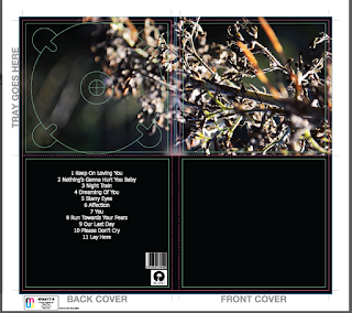
But, before I could do this, I had to make sure that the barcode and record label image placement was in the correct place as they had moved behind the hand image. The reason why they had moved was because I had forgotten to lock the features - however, this isn't a massive mistake, as this shows that when you learn from your mistakes, you ensure your success in the future. So going back into tweaking the placement and arrangement of the two features, I brought the barcode and the record label image back to the front and repositioned them so that they were back in the original position that I had them in at the start of the process: off-set to the bottom left and right hand corners of the back cover.
 |
| Fixed text placement |
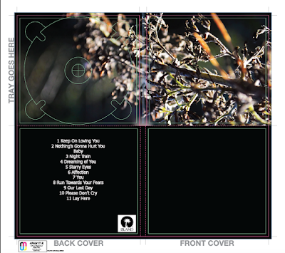
Finishing up the new placements of the individual features, I then noted that I needed to put in the publishing information on the back cover. Until I have completed all of my final adjustments and edits to the main bodies and features of the DigiPak, only then will I add the publishing information. This is because I would rather get the main features completed and ready to go and proceed into the final editing process knowing that there isn't anything that I need to drastically change. I aim to keep the publishing information simple, succinct and professional looking - possibly adhering to the same font used for the track list and the band name on the front cover, as this would enhance the element of cohesion that is readily apparent in my ancillary product.
 |
| Final adjustments of back cover (w/o publishing info) |
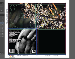
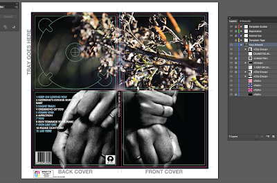
As shown to the right, a screenshot demonstrates my design in terms of the back cover of the ancillary product and the design choices that I made in order to create an effective and professional product. The final image sits perfectly on the back cover; as it highlights the wedding rings that I wanted to capture, as this highlights the narrative in my music video. Choosing a monochromatic image was done with the intention to satisfy the original designs done by Cigarettes After Sex and retains a strong relationship between their products and mine.
 |
| Altering font colour and placement |
As I briefly mentioned before, the white text didn't quite satisfy what I was looking for, as it got lost in the white areas that are evident within the back image. Taking inspiration from the original album covers and posters, I decided to alternate the colour of the track list by having one line as baby blue and the other as white. I had to make sure that the tracks that were longer and bled onto the white areas of the photo were coloured baby blue and the shorter tracks were kept to the original colour. It wasn't a long or arduous process and it accentuated the level of cohesion that I am aiming for.
 |
Alternating colours as to keep to the original album cover
|
Choosing the baby blue colour was actually a great decision as there are elements of a lighter blue shade within the edited inside cover of the branch. In turn, this emphasised the relationship between each and every detail on my DigiPak design. I am really pleased with how my design choices turned out and I endeavour to keep certain elements included in my final DigiPak design. Considering that one side of the back of the DigiPak is completed, I then moved onto designing the front cover. Again, I wanted to bring the element of monochrome through in my final design, so I inserted the second image of the hands into the document, to act as the image for the front cover of the DigiPak.
As shown below, the close up screen-shot shows how successful my design choices were as they worked well together and kept the simplicity of the design professional and cohesive. In terms of the font, I changed it to the original font used by Cigarettes After Sex: ITC Mendoza Roman Book SC. I used this font for the track list as well as the band name on the front cover, and as well as this choice in font, I also experimented with the capitalisation of the track list and found that all caps font works best as it matches up with the text on the front cover as well as the original designs.
As I move on to the final stages of the first design, I followed the same procedures that I took for the back cover image in terms of utilising the Clipping Mask and Transforming tool. Although, the only thing that I did differently was flip the image so that it faced the other way, as the original was off-set to the same side as the back cover, and having the two images side by side looked ineffective and messy.
I then added the final text of the bands name over the top of the image that is situated in the bottom right-hand corner of the front cover. Admittedly, I did toy around with how the placement would look and even tried to rotate it so that it was vertical down the side with the most free space, but this didn't add anything to the design of the product and instead looked random and unprofessional. Looking to the spine of the DigiPak, I decided to insert the bands name there as well; as I felt that it would tie the whole product together, rather than having an empty black strip that added nothing to the aesthetics.
To conclude, the first experience with using Illustrator was very successful and I am extremely happy with what I have achieved. The first design is extremely close to how I want the final design to look, in terms of utilising the element of colour on the inside covers and bringing the monochromatic design on the outside covers. The simplicity of the first design works really well, and the images really carry the narrative of my music video - creating a sense of cohesion and solidifying the relationship between all of my products.
If there was any room for improvement on my next design, it would be to experiment with more colour on the front colours, without detracting from my original intention of delivering a professional, slick and clean DigiPak, whilst also considering the aesthetic of the original band and their genre. But all in all, this first attempt of a final design is well-thought out and well put together; the next step with this design is to include the publishing information and the spine detailing.


 To conclude, the first experience with using Illustrator was very successful and I am extremely happy with what I have achieved. The first design is extremely close to how I want the final design to look, in terms of utilising the element of colour on the inside covers and bringing the monochromatic design on the outside covers. The simplicity of the first design works really well, and the images really carry the narrative of my music video - creating a sense of cohesion and solidifying the relationship between all of my products.
No comments:
Post a Comment