Magazine Advert: Continued Development

Through my exploration of these icons, I realised that coloured vector images didn't look good at all and considering that the rest of the advert is monochromatic and grayscale, the colour was the immediate focal point on the magazine and distracted from the main image of the hand.
 In order to maintain my aesthetic, I changed the coloured vectors to transparent vector images - all of which are devoid of colour. I have included a simple iTunes logo, the record label (Partisan Records) and a QR Code. As well as these features, I have also included the websites of which audiences can utilise in order to find out more information about the band, as well as the purchasing information on iTunes. Editing these vectors was simple. Initially, the record label feature was black writing on a white background, but in order to maintain the aesthetic, I inverted the colours and removed the white background and made the feature transparent.
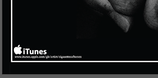 The rest of the editing was relatively simple, as the other vectors that I had chosen all had transparent backgrounds and white text, so the iTunes and the QR Code feature were able to be kept the same. Through my own evaluation, if I could change anything about the placement of the features that would be evidenced through my further exploration of the magazine design, it would be to perhaps change the position of the QR Code and remove it from above the record label feature; as this looks quite congested and messy.
 After much deliberation and consideration surrounding my chosen and intended aesthetic appeal, I am going to refrain from using colours on the magazine advert as I don't believe that for this chosen band, genre and the message of my music video, the use of overbearing and vibrant colours detract from the message that I am trying to convey to audiences and doesn't fit well with my intention. The message of my music video isn't entirely happy, but is a reflection on a very real and contemporary relationship, devoid of all of the stigmas that are reflected in Hollywood blockbusters, for example, relationships in major Hollywood films are more than likely to be depicted as "picture perfect".
 My music video focuses on the ups and downs of a relationship and what couples do to cope when faced with nostalgia and times of trouble, hence the reason why I have decided that in order to emphasise this message, the use of monochrome detailing on all of my ancillary products, instead of vibrant colours, would be the most appropriate choice of design.


No comments:
Post a Comment